Textiles & Interiors
Coyuchi Decorative Pillow Covers: Choosing Color, Pattern, and Texture
A decorative pillow cover is a small decision with an outsized effect. It can sharpen a room’s palette, soften a formal arrangement, or quietly connect the bed to the rest of the house. The most successful choices begin not with a trend, but with attention: to color, scale, touch, and the textiles already in view.
A room rarely announces that it needs another pillow. More often, the need reveals itself indirectly: a bed looks finished but somehow flat; a sofa has the composure of a waiting room; a collection of useful, well-made objects has yet to become an arrangement. A decorative pillow cover can help, though not by doing very much. Its influence depends on proportion and restraint, on the way its color relates to the wall or duvet, and on what happens when a hand rests against its fabric.
That modest scale is part of the appeal. Covers are among the simplest textiles to change, store, and live with. They can introduce a new note without requiring a new bedspread or a rearrangement of the room. Yet the smallness of the object makes the choices unusually legible. A stripe can seem lively or bossy; a blue can read as calm, chilly, or unexpectedly green; a linen surface can add depth even when its color barely differs from the sheet beneath it.
When considering Coyuchi decorative pillow covers, the useful questions are not simply whether a shade is attractive or a pattern is fashionable. Ask instead what the cover is being asked to do. Should it provide contrast, repeat a color already present, or introduce a change in texture? Will it live on a bed, where it must coexist with sheets and a duvet, or on a sofa, where upholstery and throws set the terms? The answers make the selection less mysterious—and often make a quieter choice more compelling.
Begin with the room, not the swatch
A color seen alone is an unreliable witness. In a shop or on a screen, it is isolated from the things that will give it meaning: the warm white of a wall, the gray cast of a floor, the slightly yellowed ivory of a quilt. Before choosing a cover, take inventory of the room’s existing colors. This need not be a formal exercise with paint chips laid out in rows. Notice which tones recur, which are warm or cool, and whether the room’s overall effect is light, dark, or somewhere between.
A cover can reinforce that palette by repeating a color already in the room. Repetition is not the same as matching. A soft blue cover might pick up a blue line in a rug, a painted cabinet, or a book spine, while remaining visibly distinct from it. That small correspondence helps a room feel considered without making every textile appear to have arrived in a single set.
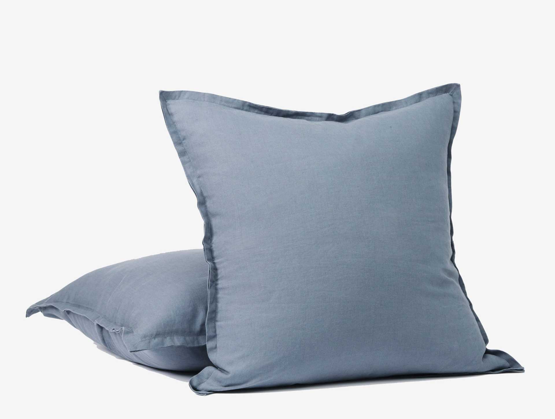
Contrast offers another route. Against pale bedding, a deeper color gives the eye a place to land. Against dark upholstery, a lighter cover can make the arrangement feel less dense. Contrast, however, need not mean a dramatic opposition. A muted harbor blue against natural linen can offer enough distinction to enliven the bed while preserving its calm. In a room already full of strong colors, a pale or earthy cover may do more useful work than another bright accent.
It helps to distinguish a color’s intensity from its lightness. Two covers may be equally pale but differ in saturation: one chalky and subdued, the other clean and vivid. If the room is quiet in tone, the vivid option can become the subject of the whole arrangement. That may be welcome. But where the aim is a gentle shift, look for a color whose value is different from the surrounding fabric while its saturation remains moderate.
Color has a temperature—and a context
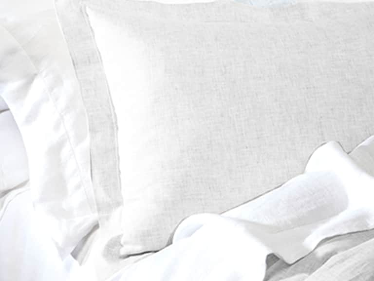
Neutrals are not colorless. Linen, cream, fog, and stone can lean warm or cool, and those undertones matter when textiles sit next to one another. A creamy cover beside a cool, blue-white sheet may look deliberately contrasting or faintly mismatched, depending on the rest of the room. Neither outcome is automatically wrong. The question is whether the relationship feels intentional.
Natural-fiber fabrics are particularly responsive to their surroundings. Their surfaces may absorb light rather than reflect it, making a shade seem softer in daylight and more concentrated under a lamp. A color viewed in isolation can therefore change character once it is folded over a pillow and placed beside a duvet. If possible, consider the textile in the room where it will be used, at more than one time of day. If you are choosing online, compare the color description with the room’s broad palette rather than expecting a screen to reproduce a shade exactly.
Organic linen has a useful kind of visual irregularity: the fabric’s texture keeps a solid color from appearing entirely flat. That variation can make a subdued shade more interesting than a smoother fabric in the same color. It also means that color and texture should not be treated as separate decisions. On a linen cover, a blue is not merely blue; the weave and washed finish influence how the blue appears, and how it sits beside other fabrics.
Pattern is a question of scale
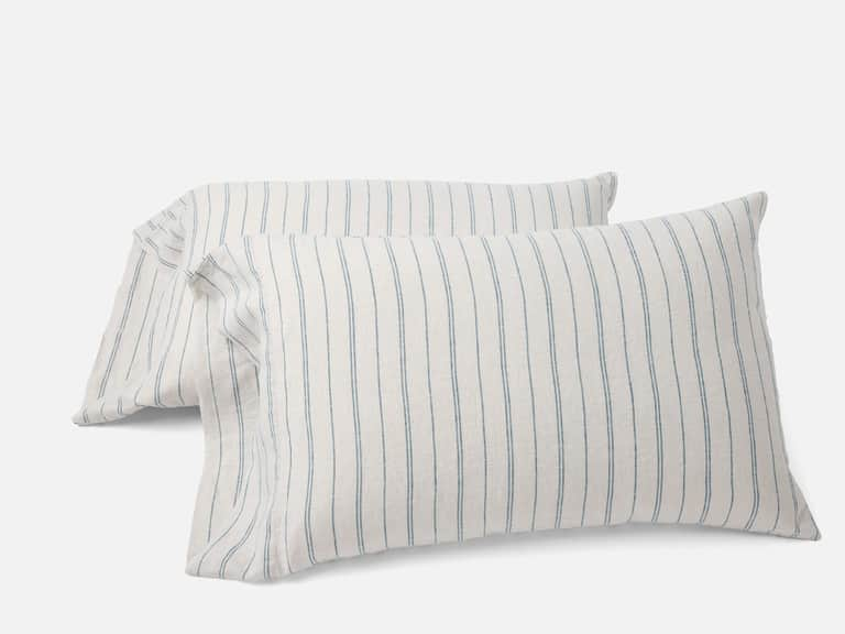
Pattern can bring movement to a room, but its effect depends on scale and company. A narrow stripe on pillowcases, for example, behaves differently from a large graphic motif on a decorative cover. A bed with patterned wallpaper, a quilt, and several embroidered details may not need another conspicuous design. A plain cover in an interesting fabric can provide relief. By contrast, a room built from solids may benefit from a stripe or another modest pattern that gives the eye something to follow.
When combining patterns, compare their scale before worrying about whether they are identical in color. A fine stripe can often sit comfortably alongside a larger check or floral design because the two patterns occupy different visual registers. Two designs of similar scale may compete, especially if both have strong contrast. One practical approach is to let one pattern lead, one support, and one—if there is a third—recede. The roles can be adjusted, but they should not all be demanding attention at once.
Stripes are adaptable partly because they have a direction. A stripe on a pillow can echo the horizontal line of a headboard or offer a counterpoint to vertical paneling. Its width matters: close, quiet lines may read almost as texture, while broad bands announce themselves from across the room. Pattern also changes with the cover’s shape and placement. A design that feels lively on a small cushion may become insistent when repeated across several pillows.
It is reasonable to mix pattern with a solid cover in the same family of colors. This gives an arrangement variation without turning it into a test of coordination. It is also reasonable to use just one patterned pillow. There is no rule requiring a decorative arrangement to look symmetrical, nor one requiring every pillow on a bed to perform the same role. A single patterned accent can be enough to give a plain bed a point of view.
Texture gives a room its quieter dimension
Rooms are often planned as if color did all the work. In practice, texture may be the element that keeps a restrained palette from looking lifeless. A smooth cotton sheet, a rumpled linen cover, a knitted throw, and a matte upholstered headboard can all be close in color yet distinct in character. Their differences emerge as light moves across them and as people use them. That is one reason natural-fiber covers can be effective even when their hues are understated.
Linen has a relaxed, slightly irregular hand. It does not need to be pressed into perfect flatness to appear finished, and its surface can make a bed feel less formal. Washed linen is often chosen for a softened, lived-in look; the fabric’s folds and ripples become part of its appearance rather than evidence of disorder. This does not mean that all linen looks or feels the same. Weight, weave, finishing, and construction influence the result, so product details are more useful than a general assumption about the fiber.
A Coyuchi Organic Relaxed Linen Decorative Pillow Cover offers a practical example: it is made from organic linen, washed for a relaxed, rippled feel, and described as becoming more supple with each wash. The cover is intended for a bed or sofa, and the insert is sold separately. Its organic linen construction and softened surface make it a plausible choice where tactile contrast matters as much as color. It is not necessary for every room, or every pillow, to make a statement; sometimes the case for a cover is simply that it brings a pleasing change in surface.
Texture also helps a room accommodate variation. A cover with a relaxed surface can soften the visual sharpness of crisp percale or smooth sateen. A more structured fabric may bring definition to a bed already filled with loose folds. Think of texture as a form of contrast that can be gentle: it changes the room’s character without requiring a new color or a conspicuous pattern.
Size and proportion matter more than abundance
A decorative cover should suit the insert and the place where it will be used. A pillow that is too small for its cover may sag and look underfilled; a cover stretched too tightly over an oversized insert can strain seams and distort its shape. Check the cover’s dimensions and the dimensions recommended for the insert rather than relying on the impression created by a photograph. A little fullness can help a pillow keep its shape, but excessive tension may affect both comfort and durability.
Consider the furniture as well. A large bed can absorb a larger accent pillow without making it feel out of scale; a narrow sofa may be crowded by several oversized cushions. One well-proportioned cover may have more effect than a collection of small ones. On a bed, decorative pillows can sit in front of sleeping pillows or be used sparingly as an accent. On a sofa, think about where people actually sit. A beautiful arrangement that must be dismantled every evening—or shifted to the floor each time someone takes a seat—may not be the most useful one.
The cover alone does not determine comfort. The insert affects loft, firmness, and how the pillow holds its outline. Since the decorative cover described above includes one cover, with the insert sold separately, it is worth treating those as two separate decisions. A cover chosen for its color and texture still needs an insert that gives it the shape and support appropriate to its setting.
Coordinate without creating a matching set
Coordination is often mistaken for sameness. A more natural arrangement uses a few relationships—shared color, compatible texture, a repeating line—without making every piece identical. A linen cover can sit beside cotton sheets; a solid pillow can echo one shade in a striped pillowcase; a warm neutral can bridge pale bedding and darker upholstery. These links are often more persuasive than a collection in which each item has been selected to match the next.
Start with the largest surfaces in the room. Bedding, upholstery, curtains, and rugs establish the broad palette. Smaller textiles can then respond to those existing conditions. On a bed, a decorative cover can relate to the duvet without being the same color, or introduce a texture that is not otherwise present. In a living room, it can connect a sofa to a rug or a nearby chair. The aim is not to make the room look as if it has followed a formula, but to make its parts seem aware of one another.
It is also useful to leave some room for the eye to rest. If every surface has a pattern, a textured solid may provide a pause. If the room is almost entirely neutral, a colored cover can supply a focal point. A pillow arrangement does not have to resolve the entire design of a room. It needs only to make a small, credible contribution.
Care belongs in the selection process
Decorative covers are handled, leaned against, and occasionally exposed to the things that make a home a home. Care instructions should be considered before a purchase, not after the first spill. The Organic Relaxed Linen Decorative Pillow Cover is listed as machine washable: cold wash on a gentle cycle with like colors, tumble dry low and remove promptly, with a warm iron if desired. Following the care directions helps preserve the fabric’s condition and can make the cover easier to use in everyday settings.
Before washing, check the specific label and remove the insert. Avoid overloading the machine, which can prevent textiles from moving freely through water and may contribute to uneven cleaning or unnecessary wear. Washing like colors together is especially sensible for new or deeply colored fabrics. Tumble-drying on low and removing the cover promptly can limit excessive creasing; whether to iron is largely a matter of preference. Linen’s relaxed appearance is part of its appeal, and a perfectly smooth finish is not required.
Care requirements also help determine where a cover belongs. A pale cover on a frequently used family sofa may call for more maintenance than a darker, easy-care option. A decorative pillow on a bed may encounter different demands from one placed on a chair by a busy entrance. There is no virtue in choosing a fabric that looks right only when nobody touches it. A useful textile should make sense in the life of the room as well as in its design.
A small decision, made deliberately
Choosing a decorative pillow cover is less about discovering a perfect color than about noticing what a room lacks. Perhaps the bed needs a darker note, or the sofa needs a softer surface. Perhaps the room already has enough pattern, and what it needs is the quiet complication of linen. Looking at the existing textiles first makes it easier to separate a genuine need from the passing excitement of a shade seen alone.
For a considered choice, take the room’s palette as a starting point, then compare pattern scale, texture, and proportion. Decide whether the cover should blend, contrast, or connect. Check the dimensions, consider the insert, and read the care instructions. These are not elaborate rules, only ways to make sure that an attractive object will also belong where it is going.
The best result may be almost imperceptible. A room feels more settled; a bed appears less flat; an ordinary afternoon on the sofa becomes marginally more inviting. A cover has not transformed the house. It has simply made one small surface feel more fully considered—and, in a home, that can be quite enough.
A quick guide to choosing a decorative pillow cover
- Color: Repeat a tone already in the room for continuity, or choose a measured contrast to create a focal point.
- Pattern: Compare scale and visual intensity with the patterns already present; let one design lead and the others support it.
- Texture: Use linen or another tactile fabric to add depth without adding a bold new color.
- Proportion: Check the cover and insert dimensions against the bed, sofa, or chair where the pillow will live.
- Care: Read the item-specific instructions and choose a fabric whose maintenance suits its everyday setting.